Design criteria:
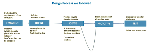
Design may be defined as the methodical approach to the solution of a problem. "Visualization is the process of representing data in a visual and meaningful way so that a user can better understand it" [Interaction-design.org]. The design approach that we followed initially is as depicted in the following figure:
Process Description in detailed steps:
1)We as a group initially, started with analyzing the dataset and then defined some problems for the given dataset.
2)With all the requirements listed, we brainstormed our ideas and tried to come up with all possible ideas from the given dataset.
Idea_01: To allow users to select their specifications for the year, selection of import/export, selection of a state.
Idea_02: The users can hover on the map and can select a particular state. Once a user clicks on a state, three bar charts appear showing the trends of total import and export, top 10 import and top 10 exports.
3)Figured out the correlation between the datasets and drive to the approach with a defined prototype.
4)Once correlation between datasets, ideas to follow are known, clearly understood the specifications, our group represented the data in a visual and meaningful way.
5)Finally, the defined prototype is tested based upon the user assumptions.
Initial stages for a design to depict a good and meaningful visualization is as shown below:
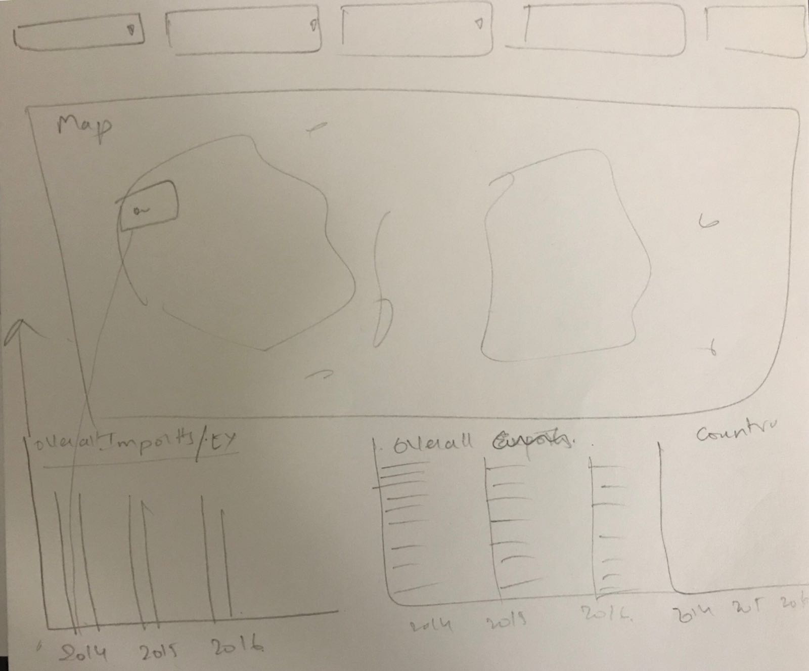
First Prototype of the visualization:
In this design process, the first type is to allow users to select their specifications for the year, selection of import/export, selection of a state. This results the visualization with their respective values in the map. While working on the first type, we decided to build initially an interactive map having zoomed in/out functionality with the user selection of specifications for the year, selection of import/export, selection of a state to hover on the map. The below figure is the first type of design:
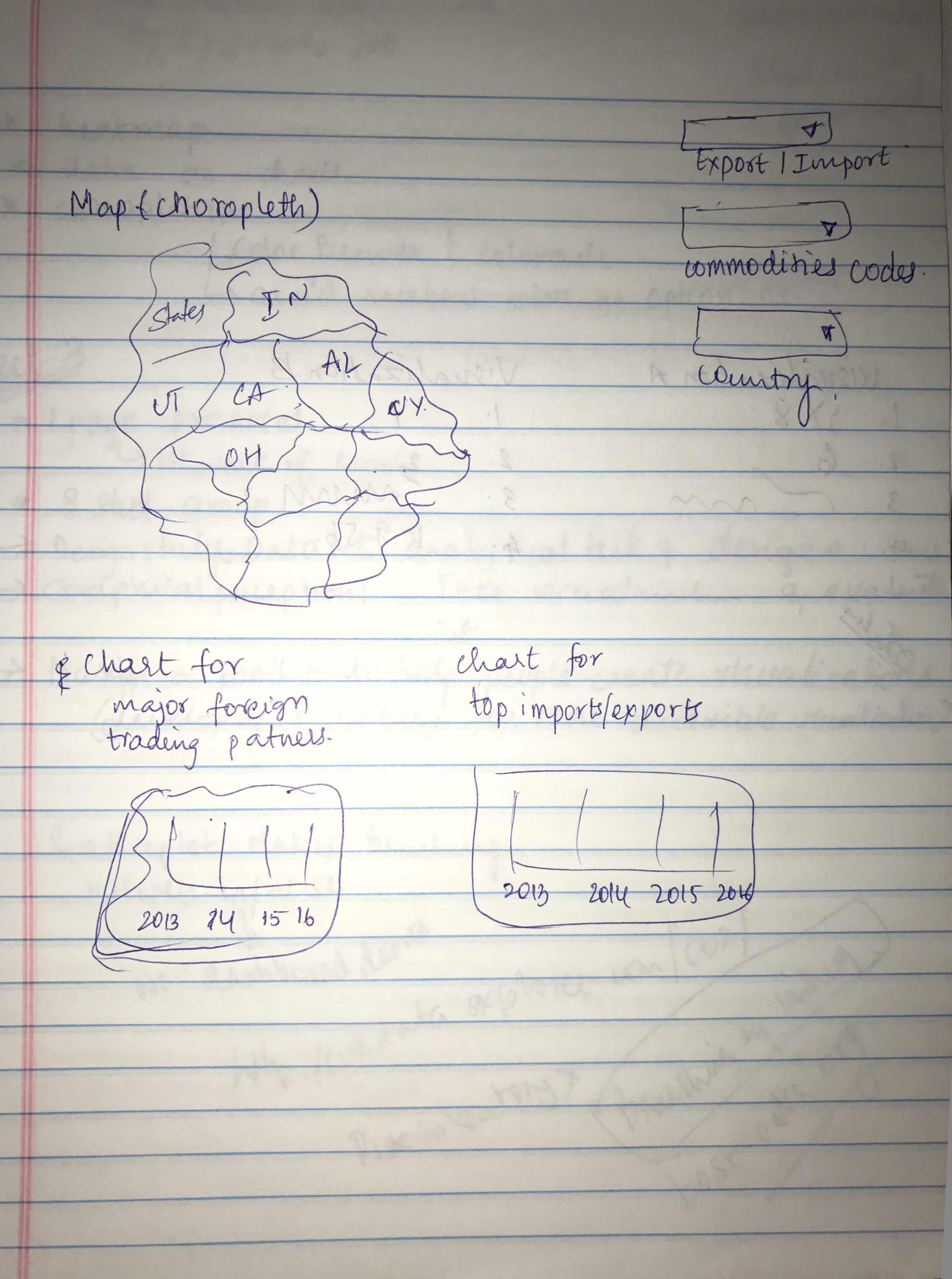
Second Prototype of the visualization:
In the design process, second type is that users can hover on the map and can select a particular state. Once a user clicks on a state, three bar charts appear showing the trends of total import and export, top 10 import and top 10 exports. The initial design came out with a map and bar chart for imports/exports of all the countries. At that point of time, figuring out how to use commodity selection was an issue. The initial design for this type is as shown below:
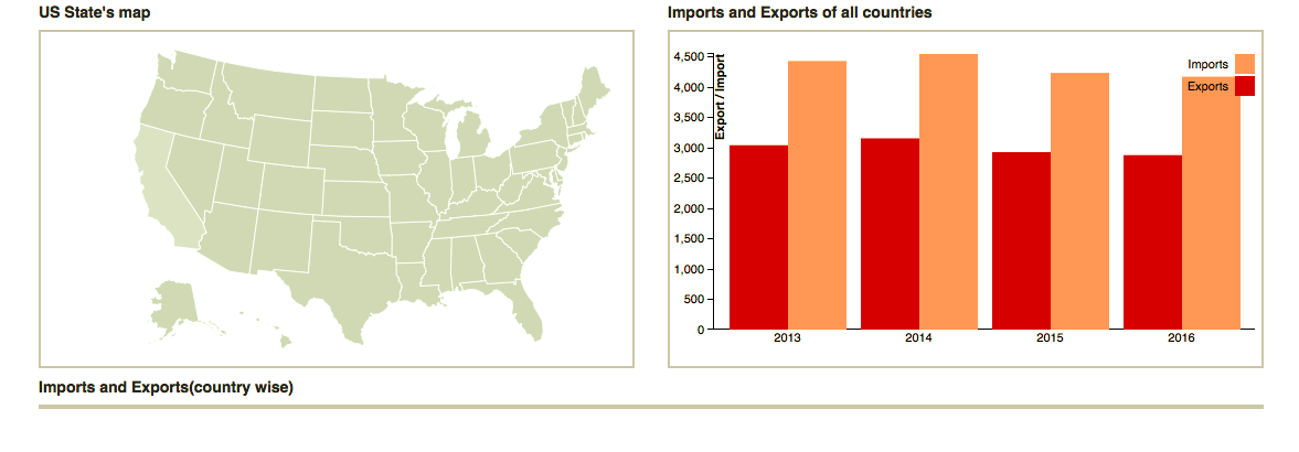
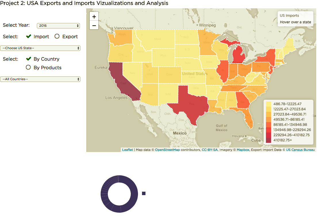
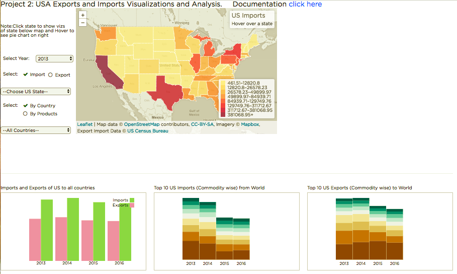
Later, the second stage for design is implemented with several d3 functionalities and came up with the a total of four visualizations. The four visualizations are an interactive map with three bar charts depicting the information about imports/exports of all the countries, top 10 imports(commodity wise), and top 10 exports(commodity wise). The figure is as shown below:

Rationale for design choices of an Interactive Map:
Designed interactive choropleth map shows the amount of imports and exports for each state of USA. The map is interactive in such a way that the user can zoom in/out and pan around the map. For this choropleth map, the legend is defined based on the range of imports and exports. When designing the map, preferred colors are initially checked with color brewer for accuracy of color blindness safe measurements.
Color Blindness Test:
Used various color blindness test for complex color blindness Deuteranopia(red/green color blindness; anomalous green cones), Tritanopia (blue/yellow color blindness; anomalous blue cones) to have a better visualize and able to distinguish different variables.
Final prototype of the visualization:
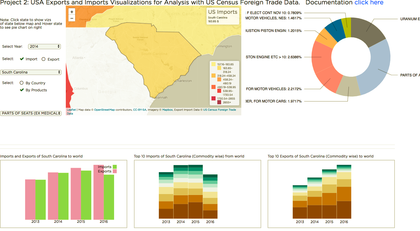
Here below is the final visualization with interactions on the map. Towards the left section of visualization, the user can select their specification with the help of following drop downs.
1.) Select Year: With this option, the user can select their required year from the given years as 2013,2014,2015, and 2016.
2.) Select: Here the user has the option of choosing either imports or exports for the interactive map to be displayed.
3.) Choose US State: This dropdown contains a list of all the states of US, when a user selects a particular state the map will be zooming in to that particular state.
4.) Select: Here the user can select the categorized data to show its interactions in the map either through By Country or By Products.
All Countries: This dropdown contains all country names as a list, where a user can select a particular country of their own choice.
The detailed description of this url with different visualizations goes as below:
Initially, the user has the option of select their own choice of year, selection type (import/export), particular US state, selection of interaction to appear based on country/products, country of own choice from the drop downs. Upon selection of their choices, there would a choropleth map with a pie chart in the upper section, bar chart with import and exports of all countries, top 10 import commodity wise, and top 10 exports commodity wise in the lower section. Here the user has an option of selecting the categorization of data either by country or by products. If the user intends to use by country then a choropleth map with all the states showing the rate of imports/exports appear depending upon the legend in the first part of the page and bar chart with import and exports of that state, top 10 import commodity wise, and top 10 exports commodity wise in the second part of the page. If the user intends to select by a particular product, then a choropleth map with all the states showing the rate of imports/exports appear depending upon the legend in the first part of the page and bar chart with import and exports of that state, top 10 import commodity wise, and top 10 exports commodity wise in the second part of the page. Here below is the figure for the above description:
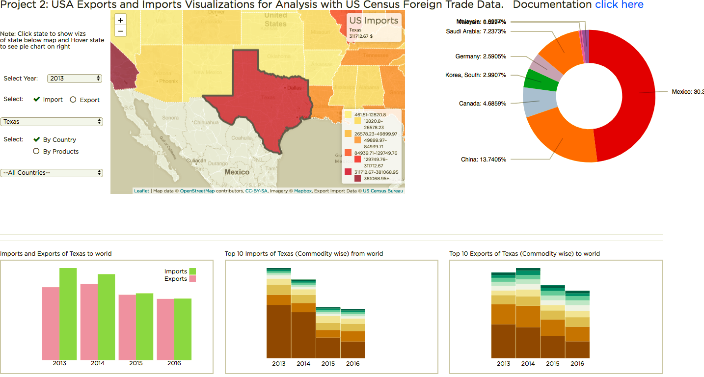
One more interesting observation the user can be viewing is that upon selection of a particular country, the choropleth map displays all the states of US of how they import/export to the selected country of choice. This is achieved by applying legends. Here below is the figure for this description:
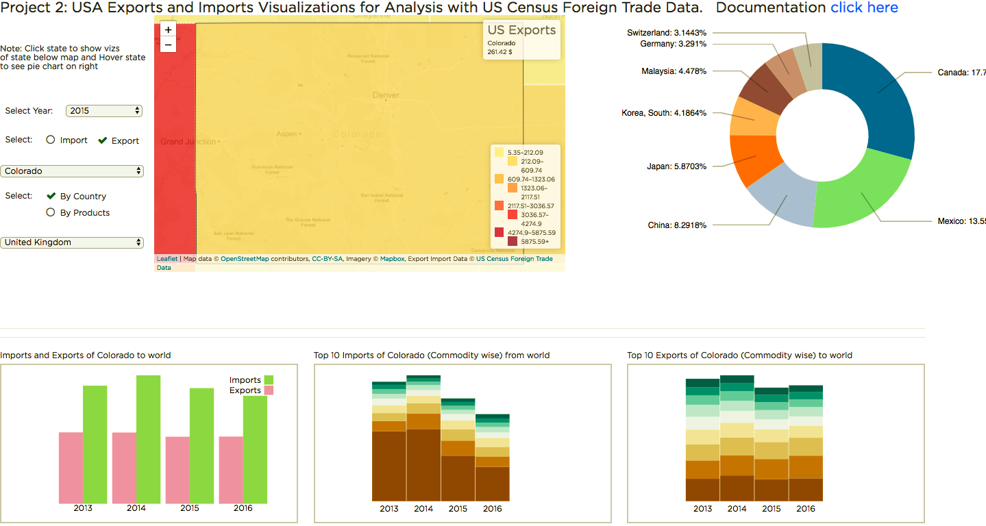
Another interesting observation is that a user can able to view upon selection by product, the choropleth map displays all the states of US of how they import/export to the selected country of choice. Here below is the figure for this description:
References:
1) http://bl.ocks.org/Sumbera/10463358
2) http://bl.ocks.org/d3noob/9267535
3) https://www.udemy.com/data-visualize-data-with-d3js-the-easy-way/learn/v4/overview
4) https://d3js.org/
5) https://bl.ocks.org/mbostock/3887235
6) https://www.w3schools.com/graphics/svg_intro.asp
7) https://www.w3schools.com/w3js/
8) https://www.w3schools.com/w3css/
9) https://www.toptal.com/designers/colorfilter
10) https://codepen.io/rstrahl/pen/yyEYBx.
11) https://www.youtube.com/watch?v=n5NcCoa9dDU&list=PL6il2r9i3BqH9PmbOf5wA5E1wOG3FT22p
12)https://www.youtube.com/watch?v=6Xynj_pBybc
13)https://www.youtube.com/watch?v=8jvoTV54nXw
14)http://leafletjs.com/examples/choropleth/